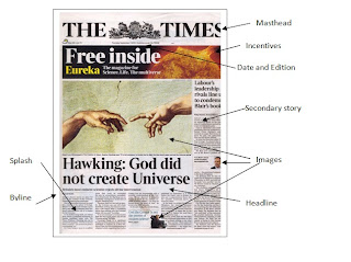
I will be using Adobe
Illustrator to create the pages for my newspaper. I am able to use the tabloid
setup on the program which allows me to scale the features on the page more
easily.
Before creating the draft for my masthead, I looked at other
examples of mastheads, including the local papers. I found that the sizes
ranged on average between 18cm – 25cm, the average being around 21cm. This made
it a lot easier towards creating it on the page and being aware of where I will
be placing the puff, the images, etc.
Choosing the font meant I had to find one that was formal
enough that it fit the idea and style of a newspaper, but not so much so that
it came across as a higher brow paper like The Times. Local newspapers use
serif fonts usually to keep the traditional feel of them intact and make the
audience feel that the paper is reliable, as it doesn’t change. The red colour
is usually a sign of the paper’s political stance (labour in the case of red). The
area that I live in is predominately Labour so it is more fitting with the
target audience. Also it is a bold colour that will catch the eye and it is
more acceptable too as it is a primary colour and most widely used amongst
newspapers.
The text around the main title I used sans serif text in
bold. The main title is supposed to give the feeling of never
changing/traditionalist, whilst the information around it is built upon constant
change, as the date of the paper is never the same and the inclusion of a web
address tells the audience that the newspaper is still trying to keep up with
the times whilst not sacrificing anything.


