Friday 28 September 2012

Timeline for Newspaper Brief


·         The first two pages of a new local newspaper, together with two of the following three options:


Timeline

July 2012:

·         Began to look into the conventions of a newspaper.

·         Collecting local newspapers, to compare the layout of each and see if they fit the conventions.

·         Analysing 3 local papers

September 2012:

·        Questionnaire from the analysis of local front covers to aid in the creation of your own (10 minimum).

·        Research into layout styles, fonts, editing, writing styles used in creating newspaper pages.

·        Research into ideology of newspapers – ideas, representations.

·        Info tree – synergy between newspaper, local companies, parent companies, job roles. Also separate one for national papers.

October 2012:

·         Sketches of the front cover and inside page layout, using information gathered from research.

·         Ideas for stories on the inside and front cover, name of paper.

·         Ancillary tasks – Radio advertisement & Poster for paper.

·         Gather/create images that will be used.

·         Drafts for pages.

November 2011:

·         Evaluation begun (see the tips and questions over the page)

·         Editing completed – end of month

·         Blog updated with all research and planning elements and the paper itself.

Monday 24 September 2012

Codes & Conventions of a Newspaper


http://www.guardian.co.uk/media/greenslade/2009/nov/10/sun-rupert-murdoch#

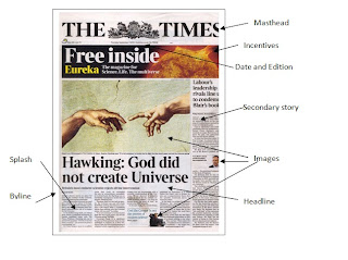
Newspapers employ different techniques on the front page to make sure they target their audience and hook them in. The main focus of the front page is often the splash. This is the day’s biggest story and often the selling point of the newspaper. It takes up the biggest space on the page so it is the first thing the potential audience lays their eyes on whilst signifying its importance.                                                                                                                            
  The headline and Standfirst also contribute to this. The headline is usually written in large block writing, and made to sound dramatic to entice readers to carry on reading. The standfirst is a continuation of the headline, a small paragraph that gives a little more insight into the story without spoiling any of it so that the reader will want to purchase it. On national papers the splash is almost always accompanied with images, adding a dimension of believability to the story, so the audience can connect straightaway.                                                                 
 The masthead is the second largest item on the page. It is the title of the paper and they all are all unique, so the paper has a sense of identity.  They catch attention by being large and bold (The Sun above uses bright red for instance, so it stands out from the black and white). Below the masthead there is room for incentives. They tend to be different every week and offer a variety of things for the reader should they buy the paper (music is often a very popular choice). This could also be replaced with competitions and adverts.                                            
  Secondary stories are placed around the main story, accompanied by a smaller headline and a Byline, telling the reader who has written the article. National newspapers also include certain sections for sport and celebrity news, which may or may not be sometimes advertised on the front page.
 

Broadsheets differ from national newspapers in the sense that they are regarded ideologically as higher class and for more intelligent people as they concern themselves with serious issues such as politics rather than celebrities.                                                                                                                                                             
 Aesthetically, they are less colourful than tabloids, as they are serious and their sole aim is to inform people on current issues. The writing is smaller and there is a lot more of it, to suggest to the reader that the article is in depth and will take more effort to read than a standard article in a tabloid. Images are used still, and are often the most colourful thing on the page. However they are smaller than those that appear on tabloids as there is less emphasis on them, they are used to expand on the article and also add a sense of realism.                                                                                                                                         
They don’t usually put adverts on the front page, but do use incentives such as the cover above. These incentives are more geared to their target audience and potentially an audience who may choose to buy the paper due to a high brow offer.  They still use the basic conventions of a newspaper, such as masthead, splash, ect. Another thing that differs between broadsheet and tabloid is the style of writing. Tabloids will often use language that makes their stories sound as dramatic and sensationalist as possible to hook readers, as well as puns which make the writer sound friendlier, establishing a connection with the reader to encourage buying the paper.                                                                                                                                               
  In this respect it makes broadsheets seem more serious and more in fitting with society’s view of them. Broadsheets simply aim to tell the reader the story and convey facts. It could be suggested that they aim for a niche audience, as tabloids try to cater to everyone by mixing entertainment with serious news, whereas not everyone enjoys reading a broadsheet.


Local newspapers are varied, as some choose to use the tabloid style layout, whilst others opt for the broadsheet style. The main difference is content, as it is all localised. News and images are familiar to those who live in the area and for this reason they have a greater sense of community than national newspapers.       
 A sense of community is what local papers maintain as it encourages the audience to buy it, so they can feel more involved with the area they live in. Adverts used are always for the benefit of local businesses and events, which again benefit the paper as there is a synergy between them – businesses pay for advertising space like larger companies do for national papers, which means the newspaper is continually funded.                                                                                                                                                                                         Depending on the demographic of the area, the content can vary. For instance the Liverpool Echo example has two stories on the front concerning sport, which is understandable as Liverpool identifies heavily with football culture. Some areas may try and make stories and features more youth friendly, especially if local newspapers have begun to utilise the internet to create a webpage for people to use. This itself can have advantages as it is more widely available for people who may be visiting the area, ect.
 
 
The 4 front pages are all rather similar to each other; there are some changes in the positioning of the articles between them. The mastheads of each paper are very similar, with the exception of the Evening Chronicle. The masthead is blue, which seems to be the primary colour of the paper as it is used a lot on the page. The rest are using red banners that have more in common with tabloids like The Sun and The Daily Star. The Evening Chronicle also uses a text which is more stylish and modern than the others, possibly as they are targeting themselves at a certain audience (e.g. younger people). The other three maintain the more formal font that most papers utilise.       
 The papers that have used the red banner are better at catching the eye personally, the blue doesn’t have the same effect, but it makes for a more interesting look. All of the papers use at least one large image, the Gazette and The Chronicle both place it at the top of the page, but not for the main story. This is also the case with the Evening Mail, who delegates its largest image to the smaller story. This works nicely as the large headline works almost as well as the image at encouraging you to read the paper, so it has another way to hook the reader. All of them keep the advertising at the bottom of the page, which stops it from looking bare.
 
Images Used: